HOME | Completed Projects | 25 Wilton Road – London


HOME | Completed Projects | 25 Wilton Road – London
The area around Victoria Station was never one of London’s more exclusive districts. As part of a restoration concept, many buildings such as the former Parnell House were upgraded. Gebrüder Schneider designed, manufactured and installed the modern facade with the striking blue bay windows for the 25 Wilton Road project.
A comfortable mixed-use building with more living and working spaces. When the area around Victoria Station was due for refurbishment, Parnell House in Wilton Road, which was unused except for one pub, was also converted into an attractive mixed-use building. The existing concrete structure was retained, but three new floors were added on top of it to increase the office and living space. The facade also took on a completely new look. The main difficulties during the construction work were the cramped road conditions and the walls shared with the neighbouring buildings – one of which was the Apollo Victoria Theatre.
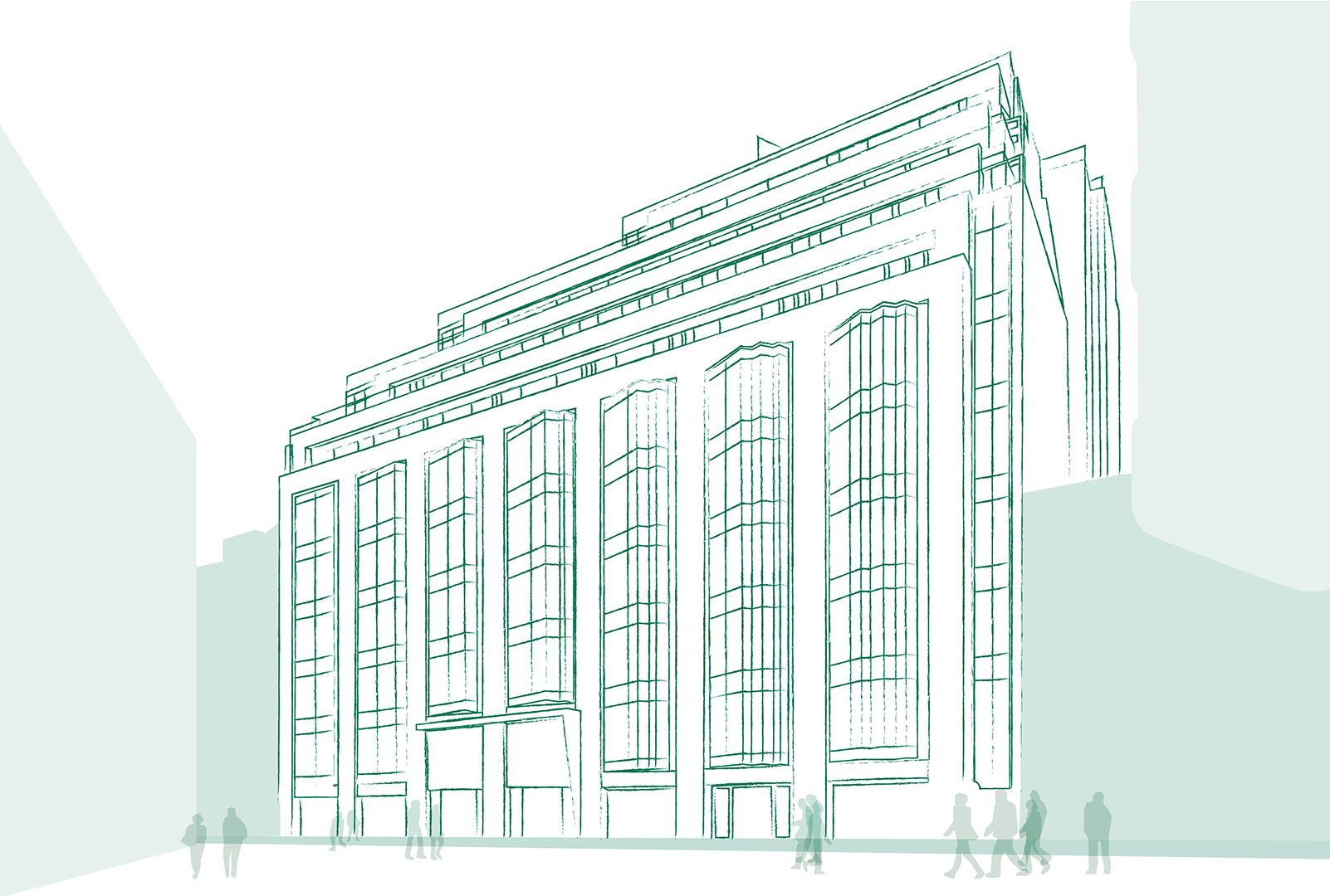
Fanned out facade with bay windows forming the focal point. The new facade is structured by prefabricated concrete elements, between which Schneider placed storey-high, fanned-out bay windows with elegant, cobalt-blue printed insulating glass. The paint for the screen printing was sampled several times in order to closely match it to the appearance of the original facades. One especially attractive detail: The gradations of the bay window glazing increase from left to right, meaning one gains the impression when walking past it that the entire facade continues to fan out. A warm wood and aluminium facade was chosen for the upper floors to emphasise the high-quality and homely character of the building.
Royal London Asset Management
SPARK Architects/ Max Architects, London
Kier Construction
2015 - 2017
3,500 m²
Fanned out bay window glazing on L1-L5, wood aluminium facades for office and residential floors on L6-L9.